Monday 29 October 2012

The Nightmare Before Christmas


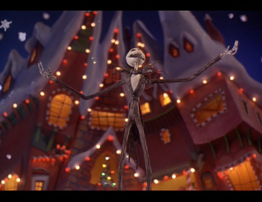
Tim Burton’s The Nightmare Before Christmas is one of my all-time favourite stop motion film.


T.N.B.C is about a character called jack skellington, known as The Punkin King who leads the festival of Halloween, but he has grown tired of the same old thing. As he’s thinking for now ideas he fined himself in the holiday wood, where he opens the door to Christmas town. After seeing the wonders of Christmas town, he goes about making his very own Christmas holiday. But things don’t go to plan


I love this film because if the exaggerated characters and the emotions they all use, jack himself  has around four hundred heads to express every possible emotion and action although he is a skeleton, no eyes, or lips, just a round head with a menacing long grin.


I also like the instant different use of colures in Halloween town and that of Christmas town, Halloween town is all dim colures such as grays oranges, dim greens, dark blues…colures related to Halloween. Whereas in Christmas town its worm colures some beings white, greens, blues, and red.

The film is a musical, but this helps build the story and the character’s emotions. And it all works very well, it also containing some interesting sayings that are true such as “just because I cannot see it doesn’t mean I cannot believe it”


Scooby-Doo, Where Are You!


Scooby-Doo, Where Are you!  Is a 1969 animated cartoon, created by Ken Spears and Joe Ruby, the show follows four teenagers Fred Jones, Daphne Blake, Velma Dinkley, and Norville Rogers  (A.K.A Shaggy) and a talking Great Dane dog named "Scooby-Doo" they all work as team to solve mysteries. 
The artwork and character design for “Scooby-Doo, Where Are You!” were done by Iwao Takamoto, was a Japanese-American and was best known for his character designs for Walt Disney Productions films such as Sleeping Beauty.


In the original program the backgrounds/scenes/back-drops tend to be more detailed, shaded and darker colour then the main characters that had little to no shading on them. However if a character interacts with the background, or item in the background they will move i.e. the bolt head door in this image that Fred has opened. Because it’s now being animated, it’s drawn in less detail and has a much lighter colour tone then the main background.

Although I don’t really watch the new Scooby-doo or the films, I do still watch the origin season  

Nick Park\Aardman Studios\ Chicken Run


Nick park is an English stop motion animator who is best known for his work in Wallace and Grimit, creature comforts and my favorite chicken run, in 1985 he joined the staff of Aardman studios where he worked on the music video “Sledgehammer” where he worked on the dance scene. He then later on to made Creature Comforts which matched the soundtracks of people’s interviews on versus subjects to animated zoo animals. 

I like nick park’s work because it is of the wide range of characters and sets designs used, and the feeling of smooth flowed movements in the actions of the models, giving them life and character to the models.
I’m not really a fan of Wallace and Gromit much, mainly because of the stories, but my favourite film is chicken run.

Chicken run is about chickens who are trying to escape the farm, till one night Rocky, a Rhode Island Red ends up hiding with them. He promised them he will help them escape when its wing has healed (which he is faking) 

I find it funny because it’s an adaptation of the fill The Great Escape, but with barn chickens. The detail that is put into the characters and sets are amazing, as each chicken has its own personality and design.

Dot.


Dot is the world’s smallest stop-motion animation, and it’s made my Aardmans youngest creative team Sumo Science directors Will Studd and Ed Patterson.

Dot is about a 9mm girl who has to following a path made from formulator items such a nails, coins, pencil savings, and others, event some small flowers and a bee was used to set the scale of the animation.dou to her world rolling up and chasing her. In the end she pulls two pins and makes herself a blanket of the world that was chasing her.

The character was made using a rapped 3D printer prototype and she was painted by hand, they made multiple copies of the same pose because duo to the 9mm size, she would break. Each 9mm each model was hand painted and had a very fine wire form the top of her head; this made animating her tweezers a bit easier.

When I first saw Dot it was an advertisement on YouTube, I had no idea what it was but I loved it and wanted to find out what it was. I first thought it was normal sized (everything replicated but bigger because the animations on the character seemed too good and smooth to be anything but normal scaled animation. Then when I found out it was made by Aardman, I was shocked, as most of the work from Aardman studio that I have seen is clay-motion stop-motion.


Dot doesn’t really have much of a story other then escaping the winding world that’s chasing her, but despite that it is a very well done animation. It goes to show, no matter how big or tiny the subject matter it, you can animate it.


Billy & Mandy


The Grim Adventures of Billy & Mandy was in is still my favorite cartoon and was shown on cartoon network it was created by Maxwell atoms. The series follows two children the 1st is Billy, he has a low IQ and is a hyper child who acts without thinking and cores the most trouble. The 2nd is Mandy, she is a cynical and arrogant girl who treats both Grim and Billy as her slaved and rather than her friend. Grim is The Grim Reaper and after losing a game of limbo he is forced to be forced with them both. Although he fantasizes in killing them both, but he does show he cares about them.


image


This show had a unique character and art designs. And over time the characters appearances (design quality) has changed, for example (left image) Billy, Mandy and grim are the original designs and were seen in episode 1, but this changed in episode 2 (image below) as they look kind of different more cleaner and less round, more sharper lines, even the background deign art changed from blocky shames to more detailed stills.


Some trivia: the created Maxwell atoms, you can hear his voice in reversed at the end of the credits saying “no, no this is the end of the show, you’re watching it backwards”. 

Sintel


SINTEL (aka the durian project) is the 3rd open source film by the blender foundation. The film is about a young woman called Sintel who finds a baby dragon with an injured wing, she names Scales. Some time goes by and scales can fly again, but as soon as he’s flying once more an adult dragon grabs Scales out of the sky and flies away. Sintel now is on a quest to save scales and ventures though different lands, such as snowy land, bamboo forests and rocky cliff sides.

The 15 minutes was produced by Ton Roosendall (who is the chearman of the foundation) and directed by Colin Levy who is an artist at Pixar animation studios. 


The concept art for the durian project was done by David Revoy he did the deigns for Sintel. The city, young/adult Scales, and others

i like the concept art and the movies because unlink the previous two films, As the 1st film big buck bunny was animals a big buck bunny, and three squirrels whereas the 2nd elephants dream contained two characters both human formed, but with exaggerated feathers. i.e. long faces/fingers, bodies, and ever exaggerated movements. But Sintel is human.
The film has no set time period, and I have no idea what time its from, but I think it’s set around the time before modern industrialism, before technology, where swords magic and wonder rules the lands. I like this idea so that’s why in my character designs are  influenced by this trying my best to sat away from tech or future weapons

his work on Sintel can be found on his website, as well as other work he has done

http://www.davidrevoy.com/2-portfolio.html

Kingdom Hearts characters


Kingdom hearts creator Tetsuya Nomura who is also the director, Concept Designer and Main Characters Designer for all the Kingdom Hearts games. Kingdom hearts has a very large variety of surroundings, characters and enemies. The game has a great number of enemies such as the heatless (KH:1), Nobodies (KH:2), the unversed (KH:BBS) and finally the dream eaters (KH:DDD).  Each enemy group has their own art style and designs. Here are some of them in their groups.


The enemies all carry a trade logo, with exemption of the “shadow” (top right heartless) that does not have the “heartless logo on it” and most have the same colour code (shades of blues, black, purple and reds)


Here is the development of the games protagonist Sora, left image is one of the first concepts of sora and the last one is the final look of sora,

Sora was designed by Tetsuya Nomura as the main protagonist of Kingdom Hearts. he mad sora with the concept of disney characters in mind. this resulted in an animal like boy, although the final design is human. s you can see sora originally had a chainsaw like sword, but this was changed into a Keyblade.

small trivia:  sora's cloths have tMickey Mouse's trademark white gloves, red shorts and giant yellow shoes

Tim Burton


Tim burton is one of my most favourite film directors, but I love his character deigns concepts and ideas. Most of his characters all share the same physical appearances, this being top heavy. With long thin limbs, small feet, short or small bodies and large heads, I enjoy this style of character making but like in the films it does cores problems with stability.

This is just me, but I some of his character's look a lick. A very good example of this is the main protagonists Vincent and Emily from the copies bride, and jack skellington and sally from the nightmare befor Christmas although the two films have nothing to do with each other; the main character's appearances are very similar. That being said, jack is much slender and taller than Vincent.


But not all his character deigns have this top heavy feel to them, an example of this is the design of Edward scissorhands hands. The design still has a slender feel but the limbs are more proportion to the body.
I like character designs that don’t follow a traditional human like form guild line. So this is why I like Tim Burton’s work and why it inspires me and influence me in my designs.

EDDSWORLD


File:Eddsworld Profile Header.png


EDDSWORLD is a British flash animation comedy mad using Adobe Flash and was created and written by Edward Gould who sadly died age 23 after a six-year fight with cancer on 25th of March 2012

EDDSWORLD consists of over 35 episodes (APA eddisodes) that would last from 30 seconds to 10 minutes and it also has over 150 short panel comics, flash games. The show follows the comical lives of Edd and his friends Tom, matt and Tord, 

The character drawings, animation were done by Edward Gould and co-written by him and his colleagues/ friends Thomas Ridgewell (Tom),  Matthew Hargreaves(Matt),  Tom Bown, and Tord Larsson. After Edward died the show EDSSWORLD was left under direction of Thomas Ridgewell. 

Gould had created over 170 comics that would be made public every week. They are generally four panels long that follow the plot structure as the episodes but with more on puns and word play. The comics mostly only featured Edd, Matt, Tom, and in the earliest comics Tord. Whereas the episodes contain a range of characters they all interact with

Through the 8 years the show has been running, the characters have developed and became more detailed; when it first started the characters were simple childish or rushed scribbles drawings. But they became more professionally drawn, this also shows the creator Edd and his friends skills in using Adoby flask got better.

Friday 12 October 2012

spiral knights design


the first concept design of the knight
Ian McConville works for Three Rings Design, Inc and he is the Lead Artist behind the character and playing world of spiral knights the early designs of the knights were too complex and techy robotic.
later on he developed them to be more simple and cute. Following an anime styles, (if you have played the game, from the side the knight’s head is the same form as an chibi anime characters face, big forehead, small pointy nose) the end result is a top heady designs of characters and enemies. Big heads. Small stocky bodies “peg-legs” and small limbs much like a Nendoroids models, this also made the knights more kid friendly.


a final draft of the designs


this is what the female knight looks like


I enjoy ian McConville ‘s character designs and the style of them because they are simple.im not one for the big heads, but I like the idea of a character with a stocky body, slender limbs with  big-ish hands. With this look of cuteness you wouldn’t picture them being deadly mysteries.