Thursday 21 May 2015

25 of 25 summer plans


Over the summer i intend to try my best to enter into 11 second club, and do a "1-2 week challenge" thing each month where i would ask my friends/family/people i know what i should make (in my own style of course) and make them in Maya, rigged and textured so i can create a kinda database of models i can use if the need for them arise

i have plans on re creating the following characters. 


Ruby, From Ruby Gloom, a cheerful girl who is never glum or gloomy and is always looking for something fun to do with her friends


Xiao, From Dark Cloud 1, Xiao is a humanoid cat that is anagogic, fast, and crafty, she has a sling shot as a choice of weapon and uses it with delay aim


The Slenderman, From, CreepyPasta/ Slenderman, The 8 pages. he is a shadowy entity that stalks his victims and once caught he sends them to purgatory....if they are lucky


Ticci Toby, from Creepy Pasta, is a normal xx year old boy who slowly descends into madness, after burning down his home he became a Proxy to The Slenderman

Foxy the Piorat, from FNaF. Foxy is 1 of 4 animatronics in the horror game FNaF, he is broken and damage but it capable of great speeds


The Sleepless, this is that lies behind them sleepless nights, a person not quite insane but fare from normal. 


So yeah there are 6 characters i want to make, starting with Xiao. and i hope i will be able to maintain this idea and continue it for a few years, would be interesting. but now onto more important matters, i plan to try and get a job/ apprenticeship as a junior 3d modeller /animator maybe?.  also during the summer i will need to maintain a steady consistency with using maya and possibly look into learning 3d Max and any other programs that might be useful to lean

i will also need to register with a few creative agencies around UK so, if an opportunity should arise i may be able to apply...


24 of 25 buisness card and media


A friend of mine kindly took a few moments of his time to make me a simple yet effective Business Card template/ idea (since mine were just, slap a logo here and put text there)

as you can see on the reverse side there is a quotation (thought i cant for the life of me remember where its from)

"If you believe something is impossible then it will be impossible"
thats pretty much a true statement of life, in shirt if you believe its impossible, you have already told yourself it cant be done, and no matter what you do/try it wont work.

"only once you believe there is a way, then the world will off up its power to you"


Yeah i'll admit that the end part of that quote gets a little odd, but its basically saying don't give up, there is always a way to solve the problem at hand.

using his design as a template i went and added a few small changes and alterations, like removing Google+ (since annoyingly my G+ pages URL is just a bunch of random numbers also I've just noticed with this template, there is ALOT of "cyan co" on the image,, if you didn't know i was Cyan-co, you sure do now. also as you can see i pretty much just removed the 2nd part of the quote

 the 2nd/3rd versions are bunch to each other. just with a slight colour change and removal of the little idents.  and on the reverse side will contain either my old or new version of my logo, and/or a render or two of my models


it would also be a fairly decent idea to crate a Twitter account (under the name Cyan-co) for the soul purpose of following animation companies, 3d animation related news, and anything else that would be helpful to my future plans. in addition it would be a good idea to give my Deviant art and Youtube accounts a once over clean out,, as in make appropriately named folders and playlists..


23 of 25, PPP showreel.

24: Showreel

Ah show reel, show reel, what am i to put in you, things from this year are a little limited, and so are some of my older stuff, since i never got a chance to re visit  or re correct them, it would have been nice to have had, say a few models turn tables..say for example a bust of Slenderman? or you know something to show my abilities at modeling...

the showreel contains content from
*Context of practice (Losing my Colour)
*Extended Practice (Tale of Two Unlikely Friends)
* Responsive (Brothers' Revenge)
*Project Pinimena (Pinkimena Diana Pie Doll)
*Cyan Co Glitch Mode Logo
*Cyan Co new Logo

considering i don't actually have that much to show, since i some what neglected to enter/ do any competitions, or didn't think about making random models. the show reels ended up being a little but too focused on this years two projects. so the simplest thing to do would be to create a few turntables, and a short wire/clay/shadow and colour pass of a still render. and finally add some non related items such as the Pinkimena Doll.. since that was meant to be in project EP but it was cut from it, it is however still in the back ground of Mika's room. regardless i did do a couple of dynamic joint chain tests with it. 1st being a simple weave in and out of a light, but the 2nd was the doll dancing to Nyna cat.


with the showreel opening with my "old" yet usable logo but in a glitch mode form leads itself into the Project Pinkimena video with her emerging from the darkness.. following that we  see a few parts of Project EP and the rest, before landing back on Project Pinkimena.. in V2 (yet to be edited). i will be swapping the last two videos around so that Pinkimena will be the 1st and last video seen,, plus it uses the shadows to hide. in addicting it would be best if i alter the end and start logo, since they are my "signature" its best to move the "cyan-co" text and apply it with the Glitch Mod version, rather then having it stand out against the 3d new version,,,

finally sound, the music used is "fallen" by Dead_Me it is an atmospheric creepy vibe audio, and even though the editing wasn't edited to the song it some what matched up


22 of 25, fNaF and sfm


Ah the internet hit wonder that took everyone by storm, that proved that the old means of scaring people by jump scared were still scary,,,then butchered the gimmick till it was more of a slight jump then a full on mess your self... the fun game in question is the one and only,,well one of 4, Five Night at Freddy's,, witch is poorly titled i might add, since for a start you play 7 nights + cusome nights,,, so it's what "Five Nights at Freddy's + Weekend duty + Nightmares)
that and the 3d installment of the games not even in a Freddy's diner, its b
basically a haunted house,, with one  anachronistic that are  trying to kill you,,, anyway


either love it or hate it, the game has one HELL of a community and fan base, from people dressing up as said animations, to hundreds on thousands of fan art and not to mention the,,what started as cheap free knock offs to supported fan made games..like Five nights at pinikys (yeah,, even FNaF weren't safe from them bloody pony's).. to a more adult and crude game of "five nights a F**k Boys".. this game played more like a arcade RPG slimier to the older Final Fantasy games with level ups and things...

for good or for worse the community have made some rather awesome things, from creepy uet cool fan art of everyone's favored Foxy, or the extended fan fictions (Creepypastas) that kind of try to connect the dots or add extra meaning to the games hidden Lore. but im here to talk about this little "gem"

Steam Film Maker by valve  (a toned down version of  what they use for their game Trailers,) allows anyone to download comunity made mods, and carectors (aswell as having an endess collection of carectors and assets collected from your own game libiry) come a the fan favorests Five night at friends, but we arent looking at the GMod version of FNaF, or Scott Cowthens own FNaF. Oh no

i present to you the design from the some what trusted mind of miss DrawKill

 drawkill.DeviantArt with her twisted Nightmare Steam-punk  inspired versions of Freddy, Chika, Bonny and Foxy.

And wonderfully bright to life in a nightmare fuel short animation by GLS Machinima, i simply love the atmosphere, the tension  and the sense of horror portrait in these two videos. its also his plan to make a web series of animations based on these Steam-Punk nightmare versions of FNaF, but it work follow the games lore, rather its set in a time where the 4 animations have abandoned there want and murder of the night guards  of Freddy Fazzbare's pezza. they were formally trapped and now they terrorize the city, killing at will, and as hinted the animations will have a rather interesting set of abilities. i do hope they do make the web series, and its not pulled down for copy right


21 of 25, Steam softwere, for indi developers?


the PC gaming platform and application, Steam has developed greatly over the last few years, adding Green light to allow Indie Developers and game making hobbyists a chance to get their games on steam. and the (some what old) introduction to the steam workshop, that allows the community to make mods, levels,  skins and models for games such as Left for Dead, Portal, Team fortress2 , Garry's mod, and Steams own animation program Steam Film Maker [SFM].


But they haven't stopped there. Oh no, some time ago a new tab as added totaled "steam software" and one of its 1st additions were of course steams own programs like SFM, but as time went on, more and more programs started to appear, video editing programs, comic book creators, sound design studios, painting programs, game engines!, and lately 3d programs, like,,, you guessed it Blender and a Monthly Subscription license of Maya. i cant help but feel amazed about this, i'm a regular user of steam my self, mainly ether to talk to friend, watch the odd steam, or play games, and every now and then, after talking to said friend about what im doing, i would launch either Maya or blender (depending what i was using at the time) to show them what i was up to, Ah go to love the Steam thing, before it was doing the odd screenshot, funny enough, any non steam program was listed as a "game", and ironically when i uploaded one of my collage videos to my steam account (linked)  to YouTube) said friend said, "well its not really a game,, and i think its meant to be used for stuff like walk thoughts" little did we know seam would add said 3d program to steam,, meaning anything that is a video is now a "game"

i bring this up because is because Maya LT is a 1 month subscription license at  £25 a month that would be £300 a month,, a fare cheaper alternative to Maya's 1 year superscription on £1,000

downside however, is once the month is over the program most likely becomes locked until you re buy a license, that and i have no idea if Maya LT's files can be open in Maya 15/16 or vis versa

But with all grate things, they is a problem, and this problem here is an AUTOMATIC renewal, and people have been finding it rally hard/impossible to un subscribe from the subscription notice,,  good idea turned bad, also look at the review count. Maya has 35 with mixed thoughts and blender has 596 overwhelmingly positive reviews. hum, i wonder if unity will ever be added to Steam..


http://store.steampowered.com/app/243580/


20 of 25 Cyan Co logo Update


Time for an update,a a logo update! and a program change.

my current Cyan Co logo has 2 variations,  a digitally drawn version (that is used mainly for avitairs or plasedon Final image work) , and a 3d animated one (for end of videos). the logo itself is a few years old, (i kinda,, created it because i needed a 'cutie mark' for my MLP OC..yea not the best reason to make a logo is it?...) but that is a different some what single toned version of the logo, the two im refuring to are as follows..


But it was pointed out to me that with my current standing, the logo is a little out dated, as in the two cyan colourd pencils that fly in,, they are both pencil, yes the idea of the logo was to have a slight symmetrical to the logo, but its a valid point, since i hardly ever actually used a 'stranded' pencil like a HB,, no i use my rather old Mechanical pencil (the kind you would get in a large pen set not the £2 ones)  and now my Wacom tablet.

So the idea was suggested that i should change the two cartoony pencils to something more real, and relevant, so that's what i did, in addition i slightly re designed the Cyan crest (the pencils may changed but they is no way that crest will change!)

Now why recreate the whole thing you might ask? simple,,, my old 3d logo was made and animated in,,,you guessed it, blender!,,, so i had to re make it in good new Maya (i still hate you maya,, dont think i like you just yet..ahum..) so i did just that, re made it in Maya, and as much as i hate to admit, Maya does have shaders that are 10 times better then blenders standerd flat ones,,, and on that note i used a mixture of Maya shaders and Mental ray shaders, since the crest does have a slight reflection to it, and so does my pencil since it has a metal tip


Finally, still keeping my old logo but with a new change. it would play at the start of the video and it would some what represent me and my nature (broken at times) since the 3d animated version is more of a post/end credits thing..


19 of 25, Revelation,


Over the last few years its been pointed out to me by tutors. Family and friends that anything I do in animation just appear as floating and lacks gravity. And as time goes by my motivation and creativity is sapped away. When I model. Rig and texture something I am happy and really pleased with its outcome, and cant wait to start animating…. 20 minutes in I start losing any interest…3 hours later its just ticking me off…

As much as I love, well loved animating its started to get me down,,, oddly if the animation I’m doing is NOT directory project related or planned out via story bored and pre planning things like character designs, I find it much easier to do something faster. For example last years animation, Brothers revenge that was animated within 2 days (granted areas of the animation was poor…and well crap,, it was done in time) but this,,, Extended Practice’s animation, try as I may to stay with the story bored I just cant. Detailed or vague I work faster when its pure impulse and improvisation.

Before I have set my self to be an animation generalist, and I wanted to focused more on animation, but It accursed to me that I would be better off focusing towards to technical side, the modelling and rigging, and maybe the texturing rather then the animating side of things. I would still be an animation generalist, but it meant I would have a small bit more freedom and fun.

So in short up to a year ago i saw my self an an "animation generalist" mainly wanting to focus in the animation side, however, now i realize i would be better off branding my self as a 3d Modeler and animator generalist, basically meaning im still in animation, but also cross focused with the technical side of the 3d world.

18 of 25, Posters 2: CoP and Brothers revenge

18, Posters 2: CoP and Brothers revenge

After making a poster for extended practice’s animation, I decided I would also make a poster for my last years Responsive project, ‘Brothers Revenge” using the same kind of style with the main characters being the main focused,, but off centered so they weren't in the very center. I pleased The Elder Brothers in a protective pose in front of The Younger brother, who is slightly cowering behind him. And standing behind them with meat cleaver at the ready stands the tall looming butcher and behind him is the Phantom version of the Elder Brother and the Wolf cub that is supposedly the Younger one

The background used is obviously not from the animation, not is it any part of the animation the soul reason it was used is because the original file for the Brothers revenge was lost. Everything but the characters turntables..

[extra] I had planned on making a poster for the CoP artistic animation, but since the animation was short and didn’t really hold much of a story…if any at all. Its poster would only really consist of the main character standing win its room besides its hand drawn version, but since I now lack the time or motivation to do the poster, it will have to go without.

Edit note: im not 100% sure if ill have/even want this project to be in the exhibition, but a poster is still nice to have.

17 of 25, Posters: Little Red


With some research done I started to make my own little posters. It seems kind of stupid and pointless to make a one for the End of year exhibition for an animation that isn't even completed or near completed (the best its going to be is Play blasts.). So its highly unlikely the animation would even be in the show…regardless to this I spent a few hours making a couple of posters that might have demonstrated the animations idea and story. I the poster in the style of typical Animation related posters. Its main characters in main focused and in the front, with the lesser characters (or bad guys..) behind them looking down or otherwise ‘evil’

Since the animation for Extended Practice was based upon Little Red riding hood, the posters main central point would be Little Red and the Wolf standing in the middle of a wooded path. And towards the bottom 1/3 of the poster I decided to place the main character, well one of them, is on her bed reading a book so I made. And just like the few posters I looked at, I placed the Shadow Wolf above them with a dark ‘fog’ coming downwards from the tree tops, far background and sides as if the darkness is closing in. in addition as a small side detail. Since the story is a book, and its just a dream, the outer edges of the poster have the books pages as details…

I had thought of doing the animation in another way. Withal the characters looking at each other (in a landscape format). With Mika and Little Red looking towards each other as a mirror image. The wolf in front and center between then both and the Shadow Beast behind him… but I decided against it as it didn't really demonstrate what the story is


16 of 25: poster research.


Since I was going to make a poster for my animation(s) I thought it would be best to do some research into how posters are layed out and presented. Text colour composition, look and feel. All of it being something important and gives meaning to the poster itself. Most posters tend to focused on a main characters or event of its respected animation,
for example one of Tintin’s posters contain a compilation of in film shots and ‘mug shots’ of secondary characters


Some posters designs such as Tim burtons 9 gives off the feeling of being alone and lost in a world that’s been forgotten. Each poster from 9 feature either the main character ‘9’ by himself, or standing in front of the other surviving “beings’


On a similar note, quite a few animation posters opt to display one of its key characters in a pose, mostly looking towards the camera/ off screen in the middle of an action, examples of theses are Monsters University, Rise of the Guardians and /Frozen(along with many others)

Most of the animation posters all have a central/ middle line of focused where its main character(s) is front and center with secondary characters standing beside them (normally either a full body shot or a mid section upwards shot) , and the ‘bad guy’ of the story larger and more dominant

15 of 25, Fixing Dynamic joint chain


Even though the animation process failed on the project. And the dynamic joint chains weren't playing fair with the skirt, I didn't want to give in, even though I've spent fare too much time trying to get the damn Dynamic joints to work with a skirt like object without it passing though the legs. The way I was shown how to make a Dynamic Joint chains (and the videos on you tube) all demonstrate a single item, like rope, a tie, a straight piece of cloth like a cape, all of witch would rest on or against something, and would have to wrap around the object or follow it fully. Non of the tutorials or advice provided an answer for applying a Dynamic Chain to a skirt like object. After a few hours of trying different methods. From

1,> parenting the Skirts Root bones to the Hip bone.

2, > parenting the left side of the Skirt Root joints to the Left leg and same for the right side..

3, > make a Controller and parent it to the leg joint then parent the Dynamic joint chains Folical to the Controller

till finally I found a way to make it work..slightly

in the examples (see X blog) I state you need to make a ‘Root joint’ for each Joint chain and start the dynamic chain below it (start joint). . but I found out when you do this and make the curve a hair dynamic, the follicle is/should be placed under the Root joint of the chain, this makes the dynamics work from that joint onward… but if you do everything the same but DON’T make a ‘Root bone’ when you create the hair system the hair follicle doesn't parent to anything. This I wound interesting. So like I did with test 2 and 3, I sight up parented the Follicles from the left side to the left leg, and right side to right leg. by doing this the joint chain followed the leg and maintained its dynamic nature, this meant that the leg was no longer passing though the skirt item…

but now they was a new problem since the skits joints follow the leg, from its rotation, and not from the hips rotation the skirt tend to pass though the characters backside…rather then staying put at the hips…simple-ish solution to this is to make a single root bone (not connected to anything) and skin it (with the Joint chain) to the skirt item. Now when the skirts dynamic chains move with the leg, this root bone stays put at the hips, maintaining some of the skirts shape..

(Note: i would have had some screenshots of this fix if not for my laptop battery dying and Maya crashing as a result)

14 of 25, Random animations.


when i was working with the Dynamic Joint chains for Project: EP, i thought it would be a good and fun idea to test the joints 1st,, i mean, last thing i needed was to spend spend half of a day setting up the dynamic joints on Mika & Red Riding hair, cloak and skirt. so my thought was to add the dynamic chains to the toy that was meant to be in the animation ((at the end Mika was suppose to wake up, grab her teddy and leave the room,, but this was cut) so the toy just became a background object, anyway the toy is based off a fan art drawing of a some what popular Tumbler blog post called "Little Miss Rarity", its much like the "ask Pinkimena Diana pie",,, (oh right, WARNING: may contain pony stuff,, ok?, good)

So this doll was a good subject for the dynamic joint chains since her main and contained a front and back, an her tail was 1 item, so a total of 4 Dynamic joints were needed. Soo, i set it up i added a little Curve drag and attract, and made the Pinkimena doll step into the light in a some what creepy rag doll like pose then leave, humm ok good, the test worked, her mane and tail flowed.  Oh also this was to see what was the best way to connect the dynamics to the rig, do i
A, set everything up, bind the joints, then simple parent the Root joints of the dynamics to the Characters model,
B, parent the dynamic hair Folical to the respected area (ie tail to the hip controller and main to the head controller)answer, bones,
~the Dynamic joints were created from the very based of the tail/ mane to the very end~


the 2nd test was mainly me being bored, and a little irritated with the wolfs fur, so i had the idea to make Pinkimena Dance,, dance to what? non other then the Nyan Nyan dance. this test was also to serve as "who much moment can the joints take before exploding in on them selfs" turns out, quite a bit,, that is until you have a fast motion followed by a sudden stop (ie a head turn/ body spin)
~the dynamics here were the same as the last version, but i moved the joints to they were allied with the edges, and added a few weight pain smooth tool.


And finally, this was a complicate random test, and after watching a few umm Steam Fim maker (SFM) videos, i came across a "Sweetiebot: Fear me [SFM Remake]"

so i thought i might be a good idea to have a little fun with Mika, to see if her hair works probably, and to see if the blend shapes i made were capable of lip syncing. and to see if her hair would rest back in its some what original location and shape. secondly the eyes change colour. yes this is some what stupid but it was also a slight test to see how i could change the texture map over a set amount of time (since ive been wanting to find this out for some time..hey come to think of it, i don't think you can do a textur swap in blender without a stupid amount of steps)


~her hair's dynamics, unlike Pinkimenas, its set from half way down to the tip, meaning only the parts NOT touching her head will move.

13 of 25, MMD's upgraded characters and system?


I once briefly went over different animation
programs in the past, im going to re viset on of them ares. Miku Miku Dance [MMD]  the software was first released on February 24, 2008, and it's current "stable" version is MMD 9.12 on July 16th, 20014,  when you 1st download the program you are given a set of Vocaloids Own mascots (the main characters such as Hatsune Miku, Kagamine Len and Rin, Kaito and Luka + several others)  these models however were never updated beyond their original release, back when the program had no optimization and were a little power hungry to render in the view port in real time, in addition the original version of MMD only had 240 and 360p resolution, but now its capable of a standers 720/ 1080p HD to 4K.

The program is rather minimum in its layout and controls. as well as it system requirements, its possible to use MMD on an old Windows 95 computer (i have tried) 'seven when you flood the program with characters, props and stages it still doesn't seem to slow down too much. second to this, the program has an insanely large following of fans who regularly make new content for MMD,, whats this a new animes come out? 3 days pass* a whole new line of MMD models made based from said anime. MMD's models are saved as PMD and PMX data, and its intentionally potable to save and export an animation data and re import the same data onto another model (since MMD models are made using the same Bone naming convention/ re set rig to model from) even the more smaller child like models (im comparison to the normal MMD modles that are 'aged' between 14-18 with len and Rin being she shorter of the default models at the ages of 14, and Luka being the tallest at the age of 20)

the program was continuously and regularly updated and bug tested until on May 26, 2011 where the last update came with a closing statement stating by the software creator that they leave the development and in the hands of the fans. despite this statement the sauce code for the program was never released and the dev team have no intention on ever releasing it,  making it impossible for its fans to continue its development,,, (kinda strange if you think about it)

however this didn't stop the fans from making an alternative version of MMD called, Miku Miku Moving, it shares the same base functions as its sister program, but also supports a larger collecting of file types, and it also supports the Oculus Rift.. (you know in case you want to feel like your in the same room as a couple of dancing anime charectors,,,wow that sounds kinda creepy...)


but back to the fan creations, as said the base characters that were 1st made with the original version were rather low poly to prevent lags or program stuttering, but since then computers have improved ten fold and the program itself is farm more better optimized, witch means people are able to make much higher quality models, as shown to the left..and needles to say some creators have a tendency to add a little too much detail, to the point of over flooding the model with un-needed polygons (mainly around the face area, ) but i guess it does help for a soother bend in joints and smother motions... take the shoulder for example, the original Miku(right) is really low poly, and her shoulder gets pointy, where as the Miku on the left has a smoother fall off..


This and the Rigs are also better made and bones are located in a better area, such as the clavicle and Hip joints,,, in the original version these two bone areas were considerably lower, as in the Clavicle/shoulder joint was located lower in the arm pit area and rather low down, meaning if the arm was to be raised up it would create a heavy crease..

overall. with the communities constant activity with the program, and ever better and newer methours for modeling and rigging said MMD characters, makes animating within the program that much easier.


12 of 25 , Yandere Simulator (game in development)

Yandere Simulator, possible voluntary work experience?


about a month ago i stumbled across (courtesy of JackSepticEye's youtube video) of a game that's very much in its early stages, 5% to be posies. the game is a..umm,, rather unusual game to say the least. you play as a girl who has a "crush" on her 'Sempai' and she would do ANYTHING to be with him,,even kill...yes kill the girl sees 'Sempai' as her boyfriend and if anyone was to get close to him, or anyone she deemed a threat to her she would eliminate,,, that and going to class liek any normal student,,, yeah the games rather odd as said,

the game is only 5% complete, and its mainly been made by one person and a small group of volunteers. animations and characters inside the game thus fare are "place holders" and may/may not be in th end game. once the game has hit around 50% completion to a point where its more done then finished, the creator plans on making a kick starter page and have it on Steams Green Light. his goal is a simple one, if he meets the minimum founding the game will be made relatively fast (not to say rush, rather to say more compact game mechanics or additional locations would be cut) but if it surpasses said minimum, the game will take longer to complete as he would hire a larger amount of people to finish the game, including voice actors.

Now why am i blogging about a game that in development when i'm not 100% into games Dev, simple, their is a page were he is gladly taking volunteers help,

Can I help you program the game?

""I would prefer to be the only programmer working on the game. In my previous experience, a project becomes exponentially more complicated with each programmer that is added to it. I don’t want to wait for someone to stop editing a script, or wait for someone to fix a bug, or wait for someone else to finish a task before I can make progress.""

 want to help you with the game! How can I help?

""I am not currently able to pay anyone to help me with the game. I can only accept your help if you’re volunteering to work for free.""

Update: "With that said, Yandere Simulator is presently a little over-staffed with volunteers; unfortunately, I now spend more time reviewing volunteer contributions than actually writing code for the game. If you are a skilled 3D artist or 2D artist, you are welcome to contact me at yanderedev@mail.com , but I can’t guarantee that I will have tasks for you, since I presently have more volunteers than I know what to do with.

juts a little something to keep an eye on, hum?

Also the game is updated once or twice a month and with each new version, his blog is updated with the current build ready to download and play at https://yanderedev.wordpress.com/

11 of 25, Planet Dolan Jobs & Opportunities


Mini Blog time!!


A few  months ago i was checking up on youtube and on the latest uploads from people i'm subscribed to, was kinda holing for new [GrimDark] FanFic readings, or some new CreepyPastas to listen to whilst working, and i came across Danger Dolans' update video, so i have it a watch, turns out hes started his own busiest and expanded his channels from his Top 10's and Dolan gaming, to a new channel Danger Dolan Movies. i'm not quite sure what his intentions are for this channel, or his new growing business, but one of the 1st videos were a announcement for Job Opportunities, said Opportunities range from Video editing, Sound design, Music making, and of course 2d/3d modeling and animation. something i defiantly will have to check out during summer,

its also something others might be interested in checking out as i said it covers a large away of options, and like any business, he asks for you to send an email to him directly, stating who you are, what you are (is Student, professional or Hobbyist) and send a demonstration of your work, either a link to your sight or a video of your showreel

 http://www.dangerdolan.tv/planet-dolan-jobs-opportunities/

10 of 25, 3D pystical model


Just a small blog, as a side part of the CoP project,  after making the cartoon  character Mika, i wanted to have a physical copy of her as a little figure. i had two options in front of me, 1st was buy some FiyMo. Daz Clay and make her my self, though trial and and error, or have her 3d printed,,,

 i went for the 1st option, make her out of clay, for a few reasons such as cost,  size, and enjoyment, they was once a time when i was really creative making things out of paper, card and even fabric, i've even printed out and assembled a collection of Paper Craft items character for MLP, FNaF, Kingdom Hearts, and even Metal models of star-wars ships. second to this i enjoyed air-fix models... the point is i tend to have more fun when making something, then to buy it as a whole.

that and i couldn't for the life of me figure out how to get it 3D printed, i made a account at Shape Ways, and tried to upload Mika there to get a quote, but all i got was errors,,, models too big, this parts too thin, this is too small, and its preview looked really gadded and crap..like when you select a really smoothed object in Maya and under normal set it to Hard,, it looked like that, but instead of squares it was an explosions of triangles..

So i made her out of Daz Clay, damn thing is like cement if you get it on your hands and leave it there, and man is it messy..well it is clay so, yeah,,, but i made a mini model of her, painted and,,well yeah i forgot to varnish her so the models kinda sticky...


Shape Ways is a good site to upload your own creations and have them printed off, there is almost no limit to size,, other then material and cost,, material ranging  from Plastics, to sand stone, and even metals like copper or gold downside however is, you do need to meet minimum standers for the printing process to work,, it needs to have the right thickness,, if its too fat in places or skinny on others, they is a high chance it will break. that and size,, if its too small it will simply not print, and if its too big, well its gonna cost a lot and will probably be split into parts.. when i tried to see what the price for Mika would be, the out come was Coloured Sandstone(smooth) at 2.5 inch would cost around £15-20. that's not too bad i guess,,, but damn its would be small... once i work out just how your meant to set up a model, i would more then love to get a few models printed out.


09 of 25, Ubisofts charector quolity standers


In a way this blog would have tired in with my CoP essay, mainly the part where i go on to say how the look and quality of animation and design of characters and environments has improved. and the same cant be said more then with games, wither its the PS1 look and design of Crash Bandicootand Spiro the Dragon, with their super low polygons and simple level design, to their more new adaptations like Legend of Spiro and Crash of the Titans,, where Spyro took a some what more darker themed in both art style and animation (ie his attacks seem a little more violent and intention to kill rather then to scare).. to Crash, having been made to look younger, and oddly have tatoos/ tribal markings down his arms,  he went into a more cartoony  comic root of game play.

but here we are going to talk

about Ubisofts Assassions Creed mainly, since the 1st AC game came out in 2007, Ubisoft has some what almost pumped out a new game every year, with (what i deem to be) 7 main games. AC 1( 2007) ,AC 2 (2009), AC Brotherhood (2010) ,AC  Revelations (2011) ,AC 3 ( 2012). AC 4: Black Sands (2013), AC Unity (2014),  AC Rouge (2014, and finally  AC Syndicate (2015)

Spin offs
AC Altaire Chronicles ( 2008 DS)
AC Bloodline (2009 PSP)
AC2 Discovery (2009 DS)
Liberation 2012 (was also the FIRST AC game to have a Female Protagonist PS Vita)
Freedom Cry 2013 (Digital download stand alone)
AC Identity(20015.  IOS)

AC Chronicles, China (2015) India and Russia /(TBC)(digital download)

and with this insanely long Underline story and the content expansion of its universe and ideas, they were simply too meany ideas and not enough games to squeeze it all in,, meaning Ubisoft expanded the AC world via Graphic Novels, Books, Comics, and MOVIES!...


got a little off topic here...  the point of this blog is to point out how often Ubisoft are releasing AC games, and granted some are buggy to hell and back like Unity and parts of Rouge, but it does show a vast improvements and degree of animations and overall designs of the characters and works,,, but this however is NOT a good thing. coming back to Rouge. all the games have been in Development for 3 years +. meaning Ubisoft start a new AC game before they have finished the one they are working on, that including other projects,,,this means they tend to re uses quite a lot of assets and animations, Example in AC 2 we Ezio was given a unique  way of running along beams and planks, (running with both arms out stretched behind his back) ... this animation his now been used in AC 4 and unity (Conner had his own animation).. same is said for the swimming animations, some animations like Swimming, climbing and volting can be seen in Watch_Dogs

but this rant doesn't end there, Oh no!, with each new installment of the games, Ubisoft tried to push their boundaries to get batter, but this can lead to a broken game, back to Rouge, the game uses new assets and its also using the same engine that was used for AS 4, how ever some if its assets (mainly the maps) were from AC3,,, and they were made for use in a different engine,,,((see where this is going))? with trying to do short cuts they ended up adding more work, that and they kepped adding and changing the controls layouts. well, all AC games have used the same engine, but the move not all of them use the Havoc engine for its physics,,, so its mainly the physicists parts that break, and since some of the physics are connected to the character it too breaks

over all, the AC games have indeed developed and got better and bigger (Well excluding AC unity,,half the map size, no ships,,, broken on launch)

08 of 25, animation or game? Plug and play


During my time at BAF2015 not a lot of stuff stood out (mainly due to the fact I was finding it hard to concentrate… but some animations and talks stood out. One such animation was a really unusual one by the name of “Plug and Play” by Michael Frel. And is a award winning short film (yet until DAF I never saw nor heard of it,,,) the animation is simple but odd, really odd.


then on the 5th Mar 15 (steam) 23rd April  (Google), and 2nd may (Apple) a 5-10 minute long interactive narrative game was released. Michale Frel had planned to make it into a game, but the idea was sped up buy the unfortunate realisation that people weren’t watching the full animation, instead they were simply jumping back and forth along the timeline (me including). Although the animation and the game jumps around its own internal non-linier timeline the game forses the player to interact and preform the..um deeds the game calls apron. Several Youtubers Lets players have done played the game, and their reactions were the same as the audience at BAF.. “What the hell is this?.. “  “oh god tell me it,,,AHH it is!”… a game or animation, whatever it is, its weird and funny at the same time.

the game can be vied from the following link, with sub links to the game in  its respective digital storts (Google, Itunes and Steam)
http://plugplay.ch/

07 of 25, BAF14 Pt2, things for interesting


when attending this years festival, I'm ashamed to admit i did find it hard to stay awake for some of the events, but because they were boring, or because i was not interested, rather the opposite, me and a few others attended the full festival from Monday to Friday and we stayed for the full day, but it was this that caused some of use to become tired as the days went on (and the coffees', cappuccinos weren't helpful,, i was wired sure but still tired,,,damn)

regardless, they were a few animations this year that stood out, and here are  a few..

"Girls on the run"
"Josi" or "onnanoko (jp: "girls") are common themes for Japanese animations, Recently "girls" have become very active in making. However there are considerable differences between girls drawn by men and girls drawn by wen. This program focuses on the ambiguity of "girls" in contemporary  Japanese indie animation"

This animation segment was a collection of 17 animations with various different themes and stories, it also demonstrated the ways the men portray girls vs how women would depict girls. the animations in question were enjoyable to watch, tho some were a little confusing to what i was suppose to be watching and what i was meant to be watching...

The two videos i enjoyed the most were both rather strange, cute and enjoyable to watch. I'm not really sure why i like thee two of them all.

the 1st one was Transfer Fantasista
this animation is a really odd and clever loop, it starts off normal enough with a girl waking up one day and sets out for (school). as shes running thought the streets it gets a little weird as she is launched into the air and lands in full anime "bad ass" style, for her to proceed with the running though the streets,,the 2nd time very little changed, but as she keeps getting launched into and on landing the would around her changed, such changes are a War Zone with Toy solders,  an odd 3D city and castles. a comic book style pannles, then to a more hand drawn/ painted/ sketched 2d backgrounds...this goes one for a total of 31 times (maybe 40+ i lost count) but the 'segments i enjoy the most is at 4:48 - 5:20, as thats demonstrating a 2D character inside a 3d digital work. this part kind of (and the whole video) sparked my inspiration to look into the would of Hybrid animation, and gave me a small idea on how/what i would do for my CoP and EP project


and the 2nd animation was Chisato Standred

i love the art style and story progression shown, from what i gather from the animation take place inside the mind of a girl after she suffered from an accident. and some how in her mind she relives the a lot moments again and again,, but never the park,, always school or the accident,,, (im really confused about this animation,,really, even after watching it 10 times in a row im more confused now then when i was at the festival)

overall the animation style stands out and its  nice to watch

06 of 25 , BAF14 pt1 for the better: and introduction


Much like the previous two years, I attended Bradford Animation Festival 2014 and I  attended all it's showings, including the closing award ceremony,sadly i must admit this years were the least enjoyable of the 3 years attending, but it was slightly better then last years. the reason of this is because not too meany of the animations show stood out, most were interesting, others were odd. and a few were just...why?.... just what am i even watching?...

Just like the other two years, they had a selection of films showing, the films included this year were,


Laika's The BoxTrolls (as well as a look behind the making of) ,
Ardman's The Pirates! in an Adventure with Scientists, (as well as a look behind the making of) ,
John Halas and Joy Batchelor's Animal Farm (as well as a guest speaker)

Michel Ocelot's Azur and Asmar: The Princes'
Quest (as well as a talk with/from Michel.
and finally Yi GAO and Yichang Zhu's Voyage Extraordinaire

So this years selection of animations, from both professional and student covered a wide range of styles, stories and feelings. yet they were quite a few that were sadly forgettable dude to their lack of appeal or overall appearance and others remember-able for both good and bad reasons,,,

such as 'Mute', a rather cute looking animation, with a would of 'people' that lack a mouth (so how do they eat i wonder) After a child accidentally knocks a knife over allowing it to fall on him/her, the family here a sound they never herd befor,,, the bay had a mouth, not only that it was crying. then from there a rather odd yet funny chain of events happen as this revelation spreads and all the 'people' start finding gruesome, some what violent yet oddly funny ways to cut themselves a mouth.. most use there new "gift" for singing, talking, and the odd one uses it for,, Ahum,,, other suggestive reasons,,, other all the animation was fun to watch, and i was able to vew it not once, but 3 times,  at the festival,


another film/animation was Voyage Extraordinaire by Yi GAO and Yichang Zhu's
This film was,, really confusing and inconsistent. it suffered of poor composition and passage of time... as in one moment the main characters are in one location talking about staying in the daylight , next moment they are out at sea at night

in addition the animations..or rather actions were inconsistent, example, mid way into the film the crow of the ship are dying of thrust, crow members are literally dropping dead...or passing out from lack of water (yet looked perfectly health) , but then moments later when they find land, all the men are on there feet jumping and full of energy. that and they had no problems walking a large distance to said water... for people half dead from thrust they sure were moving fast. and finally, as the movie draw to the end, it got more progressively strange and stupid,, such stupidity being the "hero" rides two sharks as surf boards,,, yet from time to time dorsal fins would alternate between that of a shark (fin and sharp) to a  dolphins (fat, long and rounded). this is however not to say the film or the animation itself was bad, i did sit to the very end of this, 40 minute  film?... i cant remember.. the film may have been slightly bad but that's not to say i wouldn't wan to watch it again

But saying all that even though at time this years Festival was a little dull at times it was still enjoyable to view new/un discoverer old animations..


05 of 25, digital drawing Requests via friends..

05, digital drawing Requests via friends..

(WARNING: May Contain Pony related stuff…and a some what pointless blog..)

Some time ago (last year to be posies) I came across a ‘thing’ on Deviant Art called “HearPonies” basically it’s a character from the show (or Original Character by fans) drawn in a heart shape patton. With my ever lasting boredom, and I decided I wanted to give it a try, but not wanting to copy (using a base template…) I my own little HeartPony of CyanRose Uploaded it to my own DA, and set it as my Steam Avatar, cause why not. A few moments passed and a few friends remarked on how “cute” it was and asked if I would make them one, one friend already had made an OC of her own, a bat/unicorn hybrid. And the other friend asked me to make her FlutterShy (one of the main 6 character.) I made said images to their specifications and they were grateful for the nicely made, Avatar.
Every now and then I had a few friends ask me to draw them something, or challenge me to draw something in my ever-changing style. I was asked if I could draw some Creepy Pasta Characters. Such as The SlenderMan, Jeff the killer, and Ticci Toby.. Slenderman and Jeff were completed in a few days… but much like the Comic idea, Ticci Toby’s image kepped getting pushed back…


(if i could make these images any smaller i would have,,, bloody ponies everywhere)


A few months back a a good friend of mine asked me if i woudl draw him somthings, somthgin that woudl some what repusent his intest in japan and the samurai worior, with hsi all too favorot saying "Need more MANA!!" he gave me express orders that i shoudl only do the request IF i was not busy or pre-ocupired with collage... much like most of the other non direct related projects thsi one kinda slipped under the raydar. but its not forgotton, i have a few sketches done, but nothing final im afrade...


04 of 25 Contests


Soooo this will be a short blog…11 second club…huh,, 3rd try to enter and 3rd fail so why bother..*sigh*
The problem with 11 second club is the audio and my failing creative mind/’spark’… yes their is a new one each month but each time the audio doesn't stand out to me and if the audio doesn't stand out then how can it help you make a plan for animating…
Another problem is animation itself. 11 second club’s segments are more focused on fecal animation and body language… I can hardly animate anything without the damn thing looking like its flooding in a pool of jelly…

On May 14 last year the audio file was “You wont tell him?” (I believe its  Matt Smiths as the Doctor talking to River Song) the audio seems dark, mistrials like something just happened and she doesn't want someone else to find out…

I had a few ‘vague’ ideas on what I could do for the animation another rather simple competition i should have tried to do yet for some reason or another i never found the time was Loop-de-loop, that and i simply kepped forgetting about them,,,

(Update note: since I've had rather bad time keeping and management skills this year, I haven't been able to complete ant contest, even the simpler ones, by my logic, thinking it would be better to divots the more time towards the project in question. additionally with said projects running i have at times completely forgotten about the contests..

03 of 25, things i miss from Blender

Yay time for a rant on Blender VS Maya!

The main thing about Maya that still bugs me even now, is it lacks some of the most useful things that have become well known tools inside Blender, such things are a thing called Modifiers, such useful modifiers Blender has that Maya could benefit from is a..

Subdivision Surface, this basically work the same was as Mayas Smooth, /Smooth mesh, but unlike Maya's Smooth view that doesn't render at times if its not set up, or that when you apply a Smooth node you cant go backwards, unless its added at the very end.


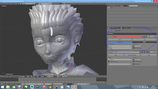
But blender's Modifiers can be turned on and off at any time, and the Subdivision Modifier can be used at the very start and you are able to edit the model With the modifier active and the effect will be the same. this means you would have fare less polygons to move around, the better part is the most if not all the modifiers never have to be applied,,, so the seemingly low poly model could contain 100000's of faces, yet the program wont slow down and in addition, the render time is the same wither you use an active modifier,

Mirror modifier, its as the name suggest, you select witch axis you want to mirror and IT Mirror the model AND connects ONLY the edges that are on the center line for you, best part of this modifier is, you can keep it active and skin (bind) a rig to it,, and along as you have the new Armistice modifier above the mirror, then the rig will work, ie you move the left arm and ONLY the left arm moves. Cool right?

the top image shows the model (Elder Brother) without the SS modifier on, the one under it has it active with level 2. the polygon display is the same tho its polygon count has quadrupedal 

and below that is what the model looks like if the modifier was applied, and it also slows down the system a small bit and adds a bit extra to render time. how ever apply the SS modifier is helpful if you are going to take the model into sculpt mode to create a normal/ bump map,


But here is a small area that people might like in Maya unless i'm missing it or rigging wrongly.  is a pose [Copy and mirror past].. meaning you can Copy the current pose for a controller, say the foot. select and copy, then select the other left and past, the mirror past would take the local location in relation the the models center point and past it accordingly with a negative value. now this is where it gets annoying in Maya,, i know most bones you can do this with, but in Maya there is this HUGE annoying problem where when you make the rig you have to mirror the bones over, this create the pones with a negative value, and when you add controllers to said bones they also need to rotate in a negative value..


They is one thing, the only real thing i don't understand with Maya, and that's, whats the point with the History? it serves no purpose other then to bog down the scene and break the model if you try to change any one of the nodes...that and the fact you always have to freeze transformations and delete the history otherwise things like UV mapping, Rigging, and simulations becomes rather buggy... i really don't see a reason it needs to be there, its not like the History nodes can even be used for anything.... needless to say back in Blender it doesn't used History nods, any edit you make is set, (well you have 100 Undo's) so you don't get any unexpected errors...