Showing posts with label Development. Show all posts

Friday, 29 November 2013

Man Vs nature idea v2


This is the 2nd version of man vs nature, and the one i will be making

based from researching taking "nature" literally and making a "Re-Claimed" even


the idea is, Due to a electrical storm like weather anomaly, several green-ish motors will strike the earth causing rapid growth in plants (we only see one close and once off in the distance). this will make the plants  grown uncontrollably along buildings and path ways. Mainly following paths to door ways and windows seeking for mankind,

this would mean the “Vines” would be acting like predators and would seamlessly and uncontrollably grow towards the camera and any other form of life, towards us?. 

in thsi is would be replacing the normal "blue" sky with a darker red-ish black sky(as the anomaly starts). its debated if its going to be still shots, or some small movements (retreating from the vines). timing will be key, as the area i plan to film in (Side street to Civic Hall/ o2 academy leeds) can get kinda busy as its a prime short cut. also, since the VFX needs a green screen element, i would be compositing people (actors) and have them react and flee(and maybe get trapped?) from the vines


Vines (Research 01)


Since i have picked "Man vs Nature" as my response to "Smoke and Mirrors" VFX, i started to look into Nature mainly vines and weeds.

the reason i focussed on a plant like a vine was because of its overpowering nature to grow on pretty much anything it can. Vines/ ivy has the natural ability to grow on any surface in any direction, and in almost any environment and element.

Moss is also a good element to look into. as it closely follows any vine type plant, normally seen on and around roof tops,IN addition to plants, i needed to see how they grow over times, 1st thought came to mind was a scene from "elephants dream" Blenders 1st open movie.


In this sean Emo starts to go a little crazy and starts fantasising. the room is a small 4 sided cube at head hight.. as Emo talks towards one of the walls it starts to move away from him, making the room expand, later he starts making small statements and the room starts to fall apart as organic- electrical type vines start to grow towards him.


VFX Man Vs Nature ideas..

Character design, “nature’s Guardians”

The design of these beings are of a human like form (minuses a finger) with a variation of plants and vegetation making up the body and face..

Feet/legs- would mostly be tree trunk type objects with lose root like appearances,
Joints- would be a sort of organic vine look to them..
Arms- much like the legs but more skinnier and mossy.. With bits of twigs     pointing out acting as spiked armor
Hands- the hands would be comprised of two-three fingers that would be “simple” intertwined vines.
Head- would have vines/trigs as hair.. the face would be void of features, and deep sockets for eyes

Ideas fo Man vs Nature

Idea 1, a tree like being would walk through the streets almost un-noticed leaving a trail of plants, grass and vines growing from its foot prints. ..(Hum boring)

Idea 2, would feature 2 “guardians” one leaving a tail of nature behind it, and the other “Guardian” would be killing said plant growth. Till both “Guardians” have a semi fight. This would cause an eruption of plant life surrounding them, till it would eventually in case them…

Idea 3 would have a “young” child like nature being causing mischief by making its surrounding nature behaves strange.  Grow uncontrollably..

The problem with this idea is..

Location- people would be around. And the “guardians” would look out of place due to the lack of reaction of the public


Models- the “Guardians” them self’s would prove to problematic, they would need to look real, making they would need to be detailed and textured (texturing a single tree was a headache…) so texturing AND rigging a human form being full of plant life will be a nightmare..

Monday, 29 October 2012

Sintel


SINTEL (aka the durian project) is the 3rd open source film by the blender foundation. The film is about a young woman called Sintel who finds a baby dragon with an injured wing, she names Scales. Some time goes by and scales can fly again, but as soon as he’s flying once more an adult dragon grabs Scales out of the sky and flies away. Sintel now is on a quest to save scales and ventures though different lands, such as snowy land, bamboo forests and rocky cliff sides.

The 15 minutes was produced by Ton Roosendall (who is the chearman of the foundation) and directed by Colin Levy who is an artist at Pixar animation studios. 


The concept art for the durian project was done by David Revoy he did the deigns for Sintel. The city, young/adult Scales, and others

i like the concept art and the movies because unlink the previous two films, As the 1st film big buck bunny was animals a big buck bunny, and three squirrels whereas the 2nd elephants dream contained two characters both human formed, but with exaggerated feathers. i.e. long faces/fingers, bodies, and ever exaggerated movements. But Sintel is human.
The film has no set time period, and I have no idea what time its from, but I think it’s set around the time before modern industrialism, before technology, where swords magic and wonder rules the lands. I like this idea so that’s why in my character designs are  influenced by this trying my best to sat away from tech or future weapons

his work on Sintel can be found on his website, as well as other work he has done

http://www.davidrevoy.com/2-portfolio.html

Kingdom Hearts characters


Kingdom hearts creator Tetsuya Nomura who is also the director, Concept Designer and Main Characters Designer for all the Kingdom Hearts games. Kingdom hearts has a very large variety of surroundings, characters and enemies. The game has a great number of enemies such as the heatless (KH:1), Nobodies (KH:2), the unversed (KH:BBS) and finally the dream eaters (KH:DDD).  Each enemy group has their own art style and designs. Here are some of them in their groups.


The enemies all carry a trade logo, with exemption of the “shadow” (top right heartless) that does not have the “heartless logo on it” and most have the same colour code (shades of blues, black, purple and reds)


Here is the development of the games protagonist Sora, left image is one of the first concepts of sora and the last one is the final look of sora,

Sora was designed by Tetsuya Nomura as the main protagonist of Kingdom Hearts. he mad sora with the concept of disney characters in mind. this resulted in an animal like boy, although the final design is human. s you can see sora originally had a chainsaw like sword, but this was changed into a Keyblade.

small trivia:  sora's cloths have tMickey Mouse's trademark white gloves, red shorts and giant yellow shoes

Tim Burton


Tim burton is one of my most favourite film directors, but I love his character deigns concepts and ideas. Most of his characters all share the same physical appearances, this being top heavy. With long thin limbs, small feet, short or small bodies and large heads, I enjoy this style of character making but like in the films it does cores problems with stability.

This is just me, but I some of his character's look a lick. A very good example of this is the main protagonists Vincent and Emily from the copies bride, and jack skellington and sally from the nightmare befor Christmas although the two films have nothing to do with each other; the main character's appearances are very similar. That being said, jack is much slender and taller than Vincent.


But not all his character deigns have this top heavy feel to them, an example of this is the design of Edward scissorhands hands. The design still has a slender feel but the limbs are more proportion to the body.
I like character designs that don’t follow a traditional human like form guild line. So this is why I like Tim Burton’s work and why it inspires me and influence me in my designs.

EDDSWORLD


File:Eddsworld Profile Header.png


EDDSWORLD is a British flash animation comedy mad using Adobe Flash and was created and written by Edward Gould who sadly died age 23 after a six-year fight with cancer on 25th of March 2012

EDDSWORLD consists of over 35 episodes (APA eddisodes) that would last from 30 seconds to 10 minutes and it also has over 150 short panel comics, flash games. The show follows the comical lives of Edd and his friends Tom, matt and Tord, 

The character drawings, animation were done by Edward Gould and co-written by him and his colleagues/ friends Thomas Ridgewell (Tom),  Matthew Hargreaves(Matt),  Tom Bown, and Tord Larsson. After Edward died the show EDSSWORLD was left under direction of Thomas Ridgewell. 

Gould had created over 170 comics that would be made public every week. They are generally four panels long that follow the plot structure as the episodes but with more on puns and word play. The comics mostly only featured Edd, Matt, Tom, and in the earliest comics Tord. Whereas the episodes contain a range of characters they all interact with

Through the 8 years the show has been running, the characters have developed and became more detailed; when it first started the characters were simple childish or rushed scribbles drawings. But they became more professionally drawn, this also shows the creator Edd and his friends skills in using Adoby flask got better.

Friday, 12 October 2012

spiral knights design


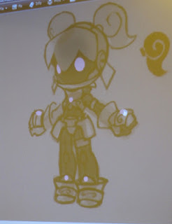
the first concept design of the knight
Ian McConville works for Three Rings Design, Inc and he is the Lead Artist behind the character and playing world of spiral knights the early designs of the knights were too complex and techy robotic.
later on he developed them to be more simple and cute. Following an anime styles, (if you have played the game, from the side the knight’s head is the same form as an chibi anime characters face, big forehead, small pointy nose) the end result is a top heady designs of characters and enemies. Big heads. Small stocky bodies “peg-legs” and small limbs much like a Nendoroids models, this also made the knights more kid friendly.


a final draft of the designs


this is what the female knight looks like


I enjoy ian McConville ‘s character designs and the style of them because they are simple.im not one for the big heads, but I like the idea of a character with a stocky body, slender limbs with  big-ish hands. With this look of cuteness you wouldn’t picture them being deadly mysteries.